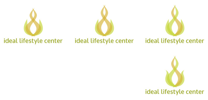
Testing colors and concepts based on some "inspiration" logos.
Developing a logo that evokes change, power, nature, melting, fire, and probably other things.
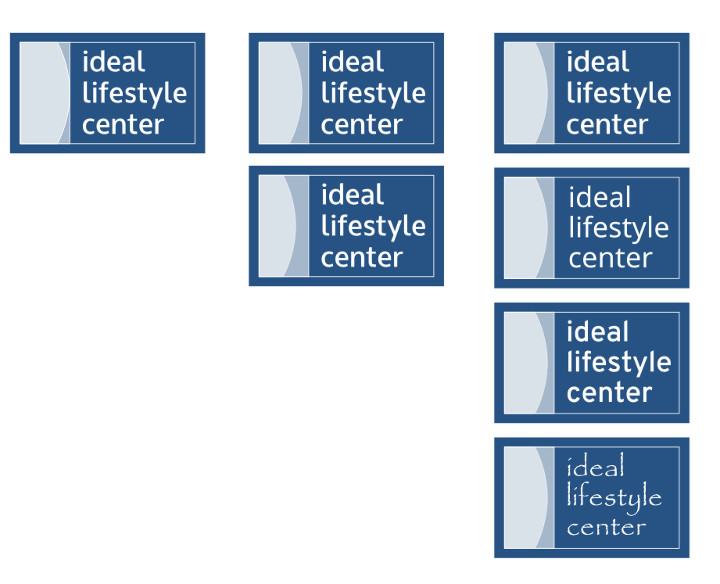
Opening some of the elements, trying color variations.
Another variant.
Color and shape adjustments.
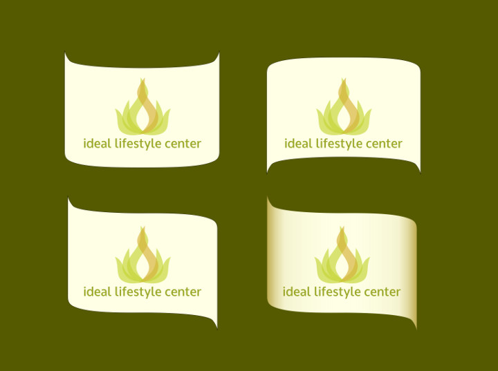
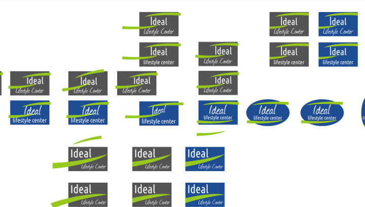
Client requested the addition of a "scroll".
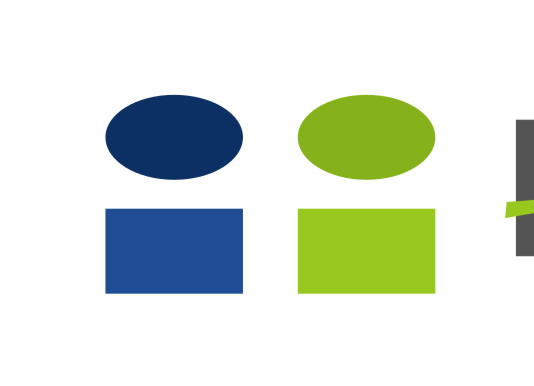
Client requested a different approach using a new color palette.
Testing some different designs and colors.
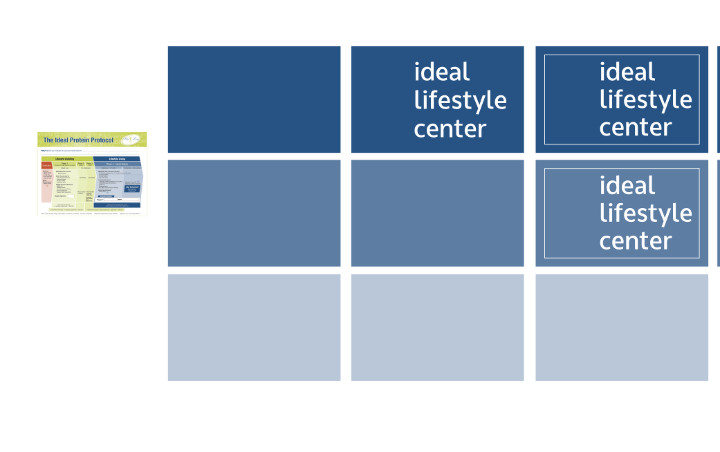
Adjusting some elements and trying different fonts.
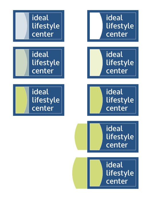
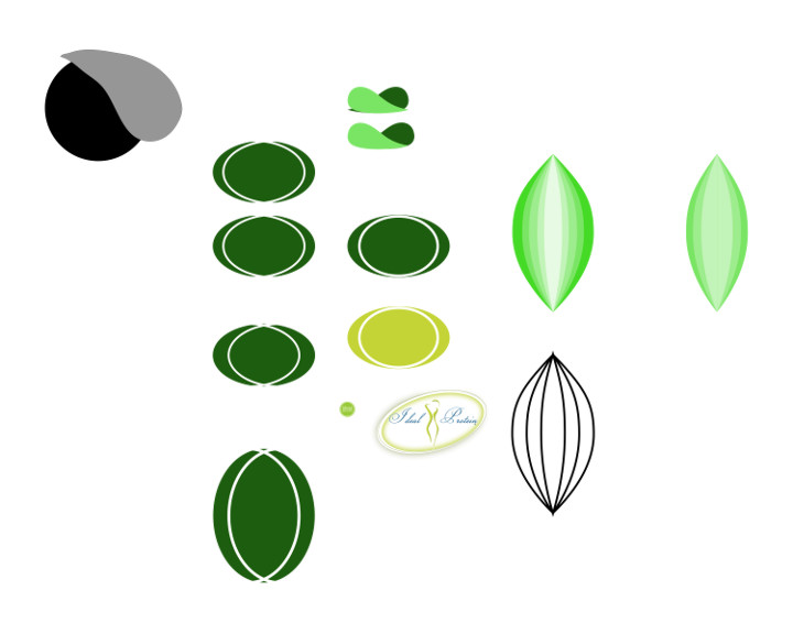
Incorporating more colors from the "inspiration sheet".
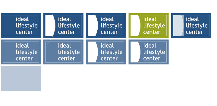
A new color set is introduced by the client.
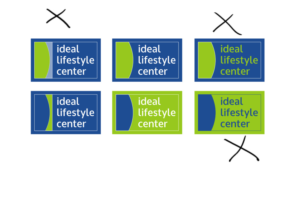
Trying the new colors on the previous logos. "X" marks the ones that have contrast problems or legibility issues.
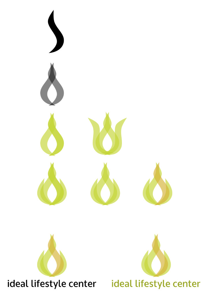
New assignment: Create a gender-neutral, organic logo that shows transition and incorporates this new color scheme. Avoid identifiable plants and animals because of possible negative associations that customers might have with them. (Food allergies, fear of butterflies, etc.)
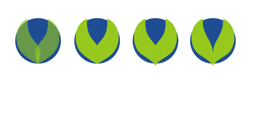
Now we are getting somewhere. A circle is an ideal shape and the design is vague enough that people can see whatever they want in it. Are those leaves draped over the world? Is it an open eye looking upward? Is it the top of a ecologically-themed superhero's helmet? Is it a seedling growing over something? Is it a green bikini top laying on a blue beach ball? It is anything you want it to be.
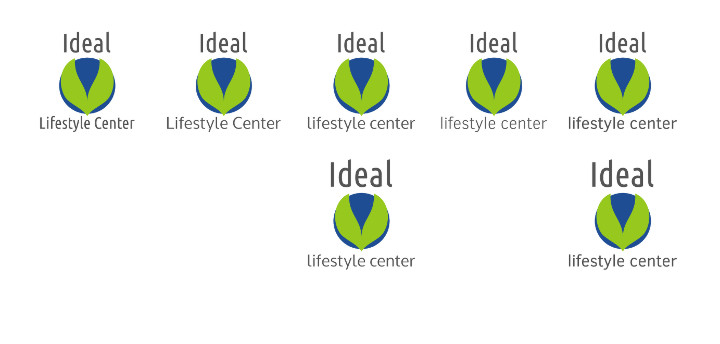
An ideal logo neads some ideal text to go along with it. No serif fonts, they are not "clean" enough.
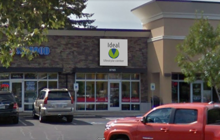
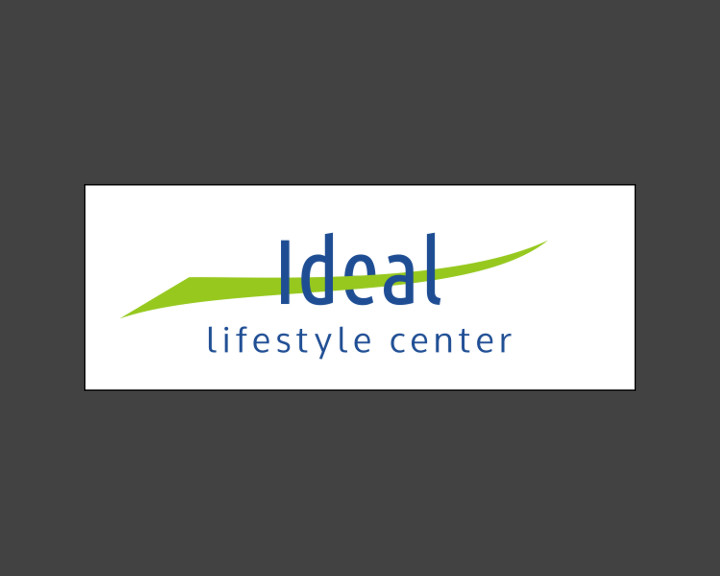
Is it believable as a sign? Yes.
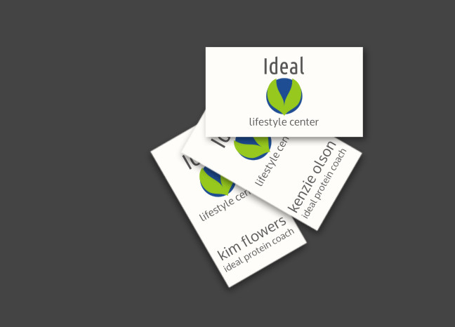
Would it make a good business card? Not as good as Paul Allen's card, but still good.
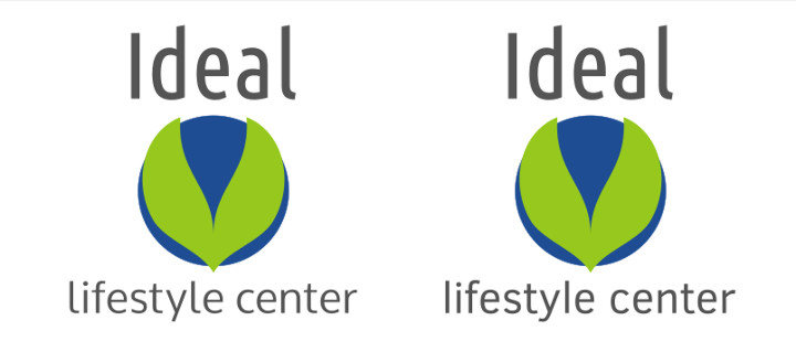
The only real question left is the preference for the text on the left or the right. Probably the left. The tail on the "y" is distracting and the rounded "l" gives a softer feel.
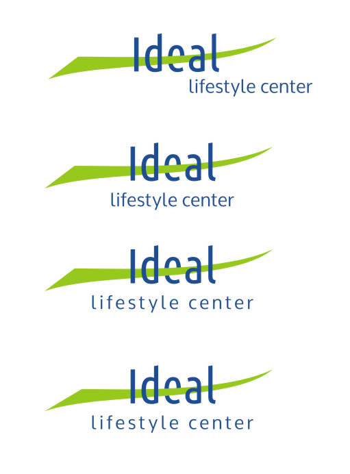
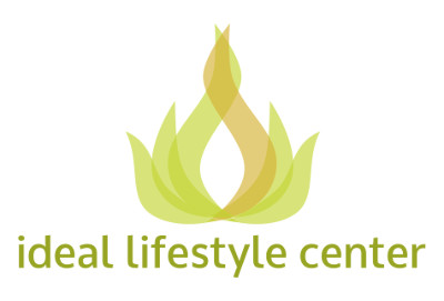
Another new approach. This time we focus strictly on the brand message that is to be conveyed. The general theme of weight loss is conveyed with a graphic that moves from wide to thin. The graphic also resembles a smile to indicate the happiness with your new and healthier lifestyle. It is directed upward to let the people know they have accomplished something and are now at the "top of their game", but it is gradual and smooth, not quick and jarring. The "e" tucked behind is a subtle and playful nod to a button on a pair of jeans. Quite often this is the goal of people undertaking a weight-loss program, to fit into certain clothes.
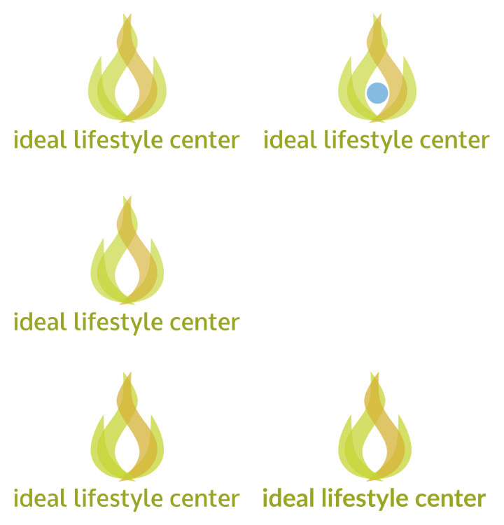
The lettering in "lifestyle center" is widened. This seems contrary to the message of weight loss, but it balances the logo and makes it look less cramped. Cramped and confined feelings should definitely not be present in a weight related logo.
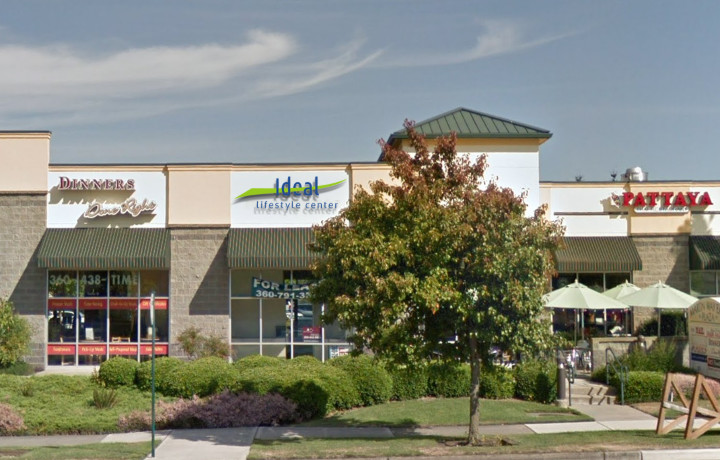
Checking how it looks on-location. Do not worry about that tree blocking the view. The trunk is so off-center that it will likely fall in the next storm.